Every new client of ours today wants a responsive designed website that looks good on standard computers but also on smartphones. If it was only computers and smartphones that would be one thing, but it’s not. We also get requests to make the site look good on tablets. Our first question is what tablet/s. They come in all sorts of sizes.
See if your site is responsive in design
We have created a way for you to test your website to see how it looks on various screen sizes. If you click this link https://ontargetinteractive.com/mobile-development/#responsive-website-design you can enter your website address in the green box and hit Go to see your site appear in the various devices to the right of the screen.
What is responsive design?
It’s a design approach that says the sites design and development should change according to the user’s mobile interface (screen size and orientation). This involves designing to several grids and layouts all dependent upon the screen width.
Sometimes when the screen gets smaller, we take away visual elements, change the way the navigation works, eliminate functionality, etc. It’s not just about shrinking everything to fit. Basically, we’re doing multiple website designs vs. just one.
The changing elements of responsive design
 Some elements will naturally shrink especially on the iOS platform. Other elements will crop the image into the size it has left. We can’t always use every image the way it is. Sometimes we need to make multiple size images and use them on the various screen sizes.
In the example to the right the name of the book shrinks but the background image is cropped. This is an example of where the mobile design will need to be something different than just a smaller version of the larger screen. If we just shrink everything the words would be too small to read.
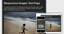
In the next example the image is coded to proportionately resize and reduce the resolution for smaller devices so it doesn’t take so long to display the page on slower mobile devices.
Had this image had text in it we would have to extract the text from the image and add it somewhere else. We could add larger text to the smaller image but that means we would have a different image file and thus instead of resizing the original image we would be swapping the image with a new image.
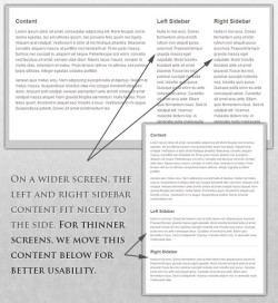 We also change the layout of the content on the site as the screen size changes. On the site you may have 3 columns of content because you have a wider screen. When you change to a smartphone you need everything lined up in one column as shown to the right.
We can control what columns go where as well as if a column is deleted and not added to the smartphone experience. When you have multiple columns it doesn’t take up as much vertical screen real-estate. However, when you take those multiple columns and put them into one column you now have an incredibly long page. From a user experience standpoint you may want to reduce the content 0n a smartphone.
A website should have just enough information to make the customer take the next step. Unless your site is ecommerce you don’t want a lot of content on your site.
 Other times we’re removing content and adding new content in different ways to make the user’s experience as friendly as possible for each device. When you reduce the size of the screen you need to ensure the content is more focused and the navigation is simplified. The example to the left shows this very well. The smartphone interface is streamlined to show the most important parts of the content.
The most common element that’s removed is the standard navigation and replaced by a mobile icon that has three lines in a box. Mobile users would rather swipe up and down than click on navigation. That’s the whole reason you’re starting to see longer pages today.
In conclusion
We are entering a new age of web design and development. You need to make sure your website is future ready right now. Once your site is optimized for responsive design, we can always go back in and create a new responsive layout for a new screen. You don’t want to do that for every screen but if one is becoming prominent in the market we can always add it for you.
Besides saving us from the frustration of managing multiple sites it’s also best for the user. We always strive to create the best experience we can for the user. Responsive design just makes it that much easier.