WordPress 3.8 Admin Interface gets a facelift.
A few weeks ago, leading CMS open-source web software WordPress released it’s latest version, WordPress 3.8. Among several changes tackled in this updated version, the most notable (and obvious) was the newly redesigned Admin Dashboard section, completely redesigned with clean, elegant User Interface (or UI) in mind.

The following is a list of some of the updated User Interface features:
1. Responsive Admin
Not only does the Admin Dashboard User Interface look better, but as with any good UI design, it works better as well. For one, the WordPress 3.8 Admin is now responsive- can I get a hallelujah?! This means that editing, uploading, or just plain posting to a WordPress site is now much, much easier on a tablet or smartphone.
 2. Light & Dark Interface Choices
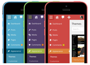 2. Light & Dark Interface Choices
Another feature that’s easy on the eyes: Admin Color Profile choices. With the ability to change your WordPress 3.8 Admin section, this helps people on the UI plane as well. In previous versions of WordPress, the background was always light in color. However in WordPress 3.8, users can change from a light interface to a dark interface with just the click of a button.
3. Typography
It’s easy to see the difference in the new typographic styles implemented in WordPress 3.8 when the admin section is paired next to an older version – using the oh-so-popular Helvetica Neue along with Open Sans, it makes a world of difference. As someone who uses WordPress on an average of about two hours (at the very least) a day, this modification is seen as wonderful improvement to the WordPress 3.8 Admin section and accepted with open arms.
Sorry, Arial, your time in the spotlight is over- at least, in the world of WordPress.
4. Simpler Admin Content Design
From the Plugins display to Live theme previews to the Dashboard default, the ease of navigating and updating virtually any section of your WordPress site is stellar. The Plugins are listed in a way which shows which are activated, deactivated, and which need updated, all largely using color as the tool to do this.
The Themes section is cleaner as well. The “Search” bar for themes has even been moved above the theme preview screenshots, and really overall, the entire design is a large improvement and cuts down on the clutter seen in versions.
The Widgets screen as well has seen a large improvement, now with more space to move things around. This all helps in moving around various widgets from sidebar to sidebar, and cuts down on the time spent maneuvering the Admin layout, with more time to focus on the Front End of your website.
All in all, I guess it’s pretty clear that I’m ecstatic about this new WordPress 3.8 update. While many people may not notice many of these little idiosyncratic changes, they really do add up in a big way to the overall use of WordPress as a content management system. Also, minor side note: the new version is named “Parker,” after ‘Charlie Parker.’ How awesome is that?
Do yourself a favor and update today- you won’t be disappointed, I promise!
(But PLEASE remember to backup your files before updating. Just in case.) 🙂