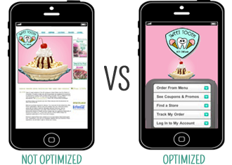
 Here are three key things you need to do right now to make your site mobile-friendly:
1. Know The Basics
Mobile phone optimization requires that you make content visually appealing for limited screen viewing by using CSS in your coding. Reduce the image sizes and ensure fonts and content are simple enough to quickly scan and understand.
Optimize your content and images by including the keywords found in your Google AdWords mobile search, and strategically sprinkle them throughout your pages. Best practice is to avoid using any ads – it’s hard enough to see your content.
Quick tip: If your site is e-commerce based, get an app developed. An app gives you the competitive edge you need to keep your customer from browsing the web and looking at your competition; instead it places them directly in your virtual store via your app.
2. Consider Your Design Options
- Google Transcode: Using Google’s configuration tool to transcode your site from classic HTML to mobile HTML won’t give your user a unified experience. When you get Google to the do work you risk having images and content resized in unattractive ways, duplicate content/error pages, and overall bad user experience. How do you avoid this? Make a mobile subdomain.
- Mobile Subdomain: Make a subdomain specifically for your mobile site. You can do this by creating a subdomain txt files. This is a key factor for search direction and indexing. Having one distinct mobile URL keeps your mobile optimization from interfering with your classic optimization (keeping the same experience on the small screen), and allows the GoogleBot Mobile to visit and index the mobile version for mobile searches.
Quick tip: Avoid using Flash, Java, Ajax and Frames. Instead try XHTML (WAP 2.0), cHTML (iMode) or WML (WAP 1.2).
3. Mobile Preview
- Run your site through WSC Mobile to ensure it is mobile-friendly and test, test, test it on multiple browsers and devices.
Quick tip: Not everyone has made the switch to a smartphone; there are still a number of users using classic phones. You’ve got to make sure your site looks good no matter what screen it’s on. Rethink your coding and design options, and look into apps.

 Here are three key things you need to do right now to make your site mobile-friendly: