Website Designs that will Inspire
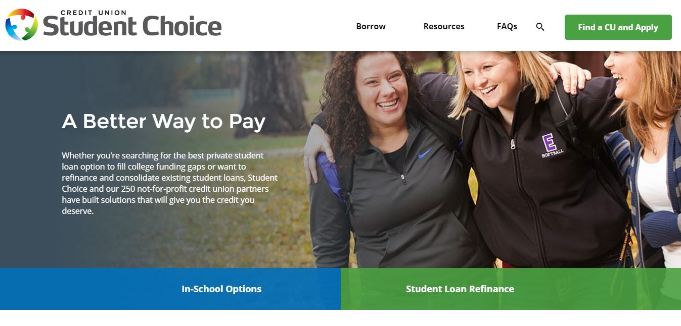
We’ve compiled some of the best website designs out there (shout out to awwwards) to give you some inspiration for your own site. You are nothing without a good website. Sure, referrals can go a long way, but I don’t place my trust in any company that has a website straight from the 90’s. If you’re website is collecting cobwebs, people are going to think you’re no longer in business. The best website designs give you the perfect layout to present your content in a clear, concise way. They give your users a platform to interact with your brand, engage with page transitions, and find exactly what they’re looking for. While some might assume that artistic creativity can’t work with ‘non-sexy’ brands like health care providers or credit unions, your company’s website can be as fun as you want to make it. Student Choice Credit Union, for example, has website that is colorful while still getting the point across.
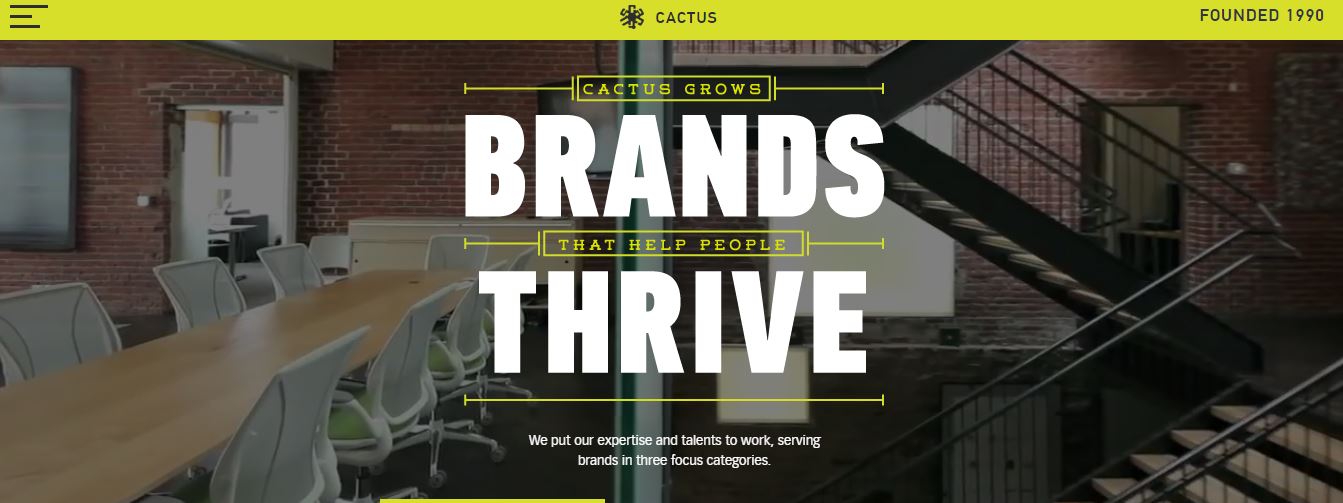
While content and ease of navigation play an important role in the conversion power of your site, looks matter just as much. We all judge a book by its cover. If you only have a few minutes to browse an entire genre of books, you better bet that you’re scanning those spines for interesting titles and typography. In the same way, your home page is your chance to sell your client on your service, product, or mission. Engaging video content, high resolution photos and sound all contribute to make your website a standout. If you own a business that lends itself to quirkiness, try something innovative. Marketing and advertising agencies are especially good at this, so use their sites as a template for your own. The best website designs will have the visual appeal to make a user look twice. And maybe even read some content.
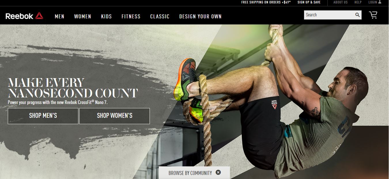
Reebok
Don’t feel limited if you’re an Ecommerce site that generates revenue from online sales. Websites like Reebok allow you to narrow your search by color, type, size, fitness, best for, technology and collection. It was made for true runners who know what type of shoe they want and exactly what they want it to look like. A good website knows its target audience and caters to their needs. If you’re reaching out to a demographic that, more likely than not, will never want your product, you’re wasting valuable resources that could go toward pleasing a guaranteed buyer.
Uprising
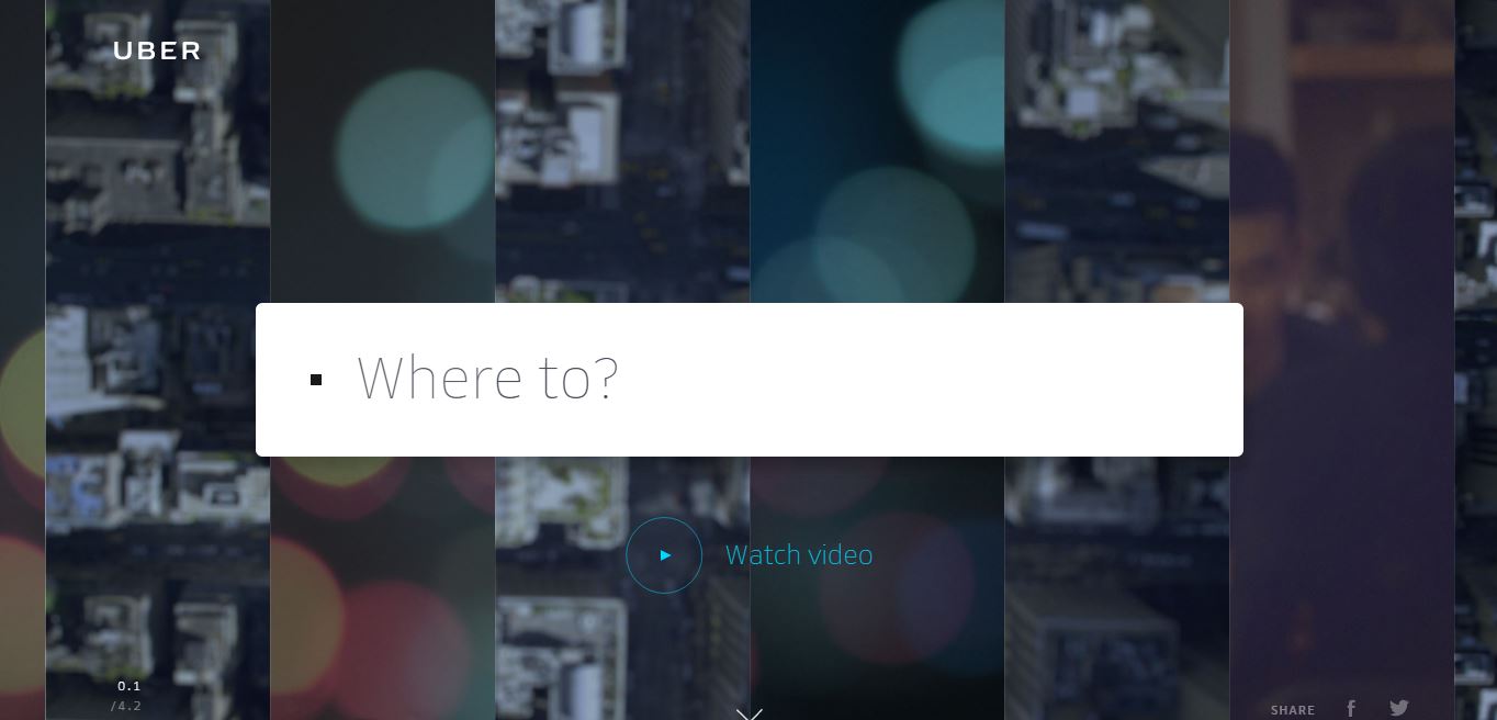
Uprising, a digital creative design and production studio, has a website that combines typography, interactive elements, and animation to make it a work of art in and of itself. The upside to having a video-heavy website like this one is that users are immediately made aware of your talents. It’s like a sales pitch without having to say anything—your visitor sees for themselves how talented you are. Uber’s website takes a similar approach, incorporating movement, large print and simplicity to showcase how easy it is to use their product. They place among the best website designs because they take the user on a journey.
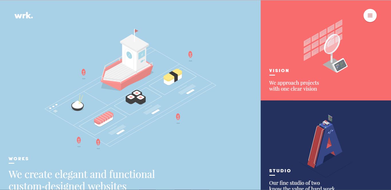
Waaark
If you feel like you just don’t have the coding chops to create such a complex website, look no further than WordPress! Believe it or not, some of the best website designs come from a program that’s easy to use and fairly inexpensive. Waaark, a creative design studio, has a website that allow you to play around with animations by moving your mouse around the page. It also features seamless page transitions that make navigation feel more like reading a book then loading up a page.
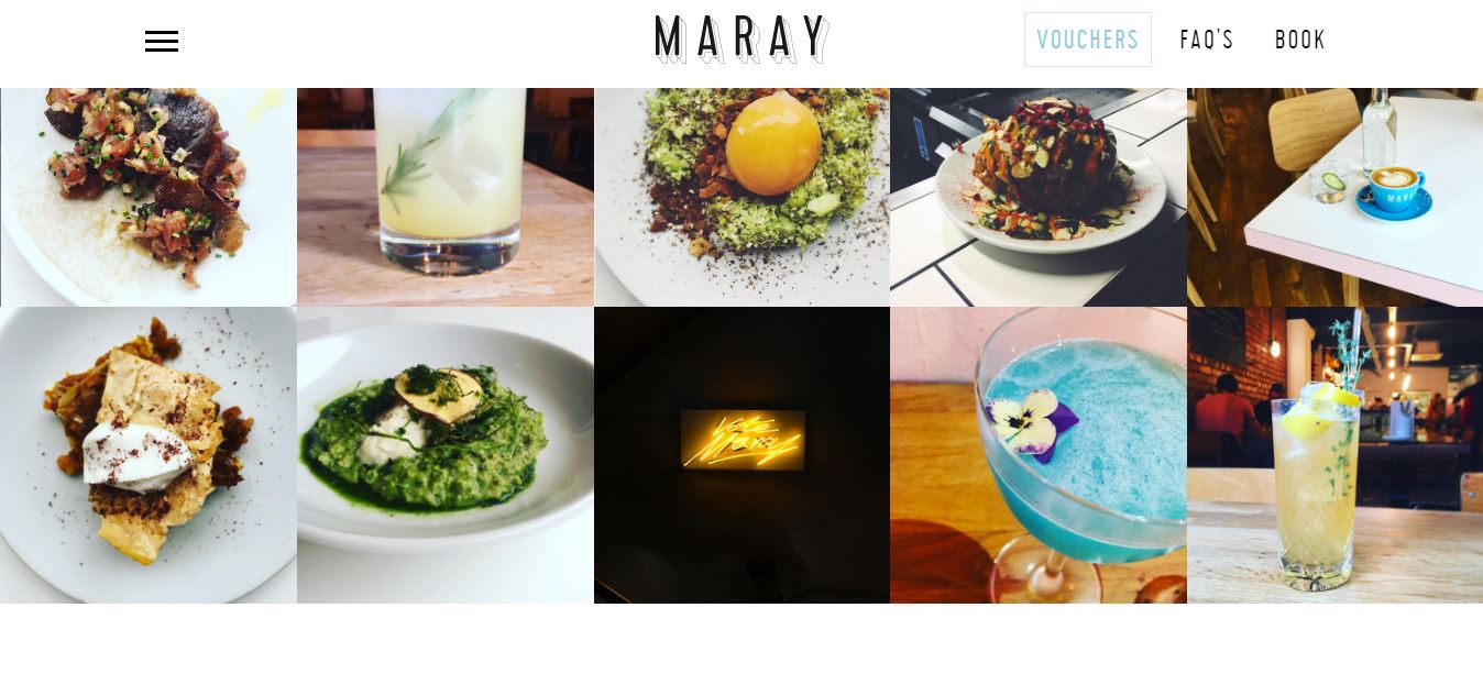
Maray
Maray, a restaurant in the UK, has a one-page scroll website that features stunning photography and chic typography. If you’re a restaurant hoping to drum up some business with your visually appealing dishes, this style might be a great option for you. The simplistic design draws immediate attention to the photos, while the large print ensures anyone can easily navigate your website. If you’re interested in finding font inspiration, check out dafont for some creative typefaces that speak for themselves.
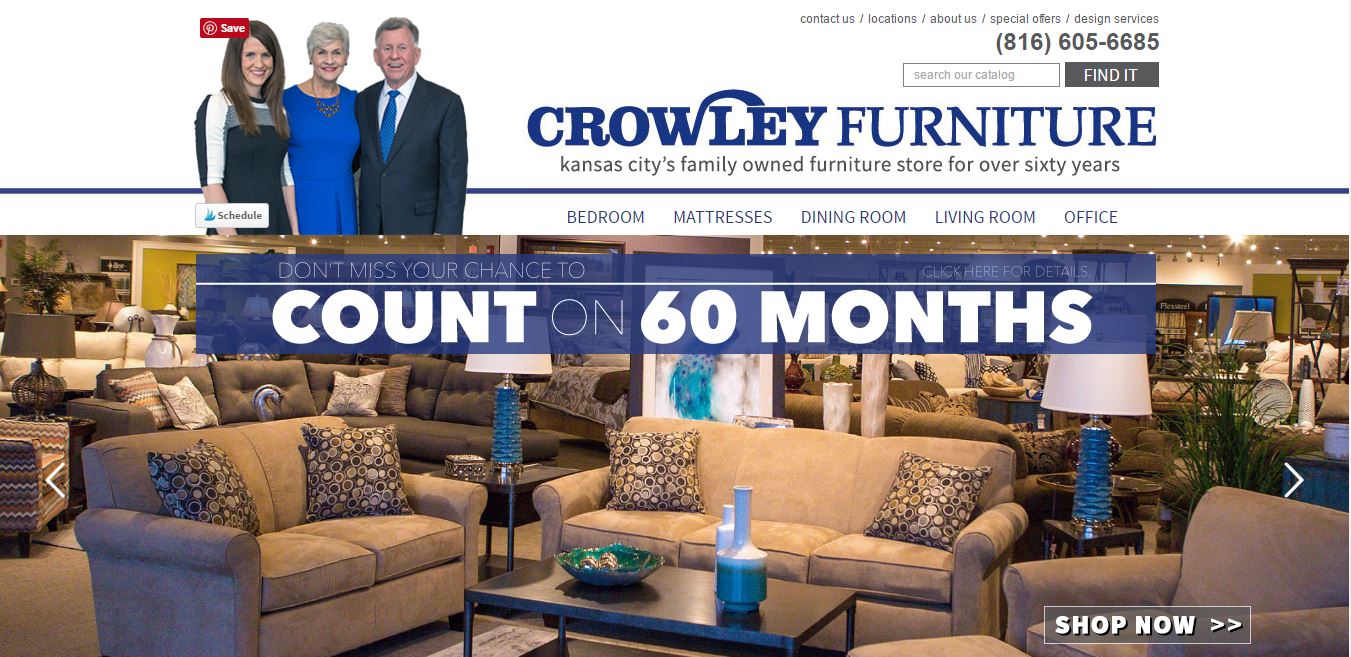
Crowley Furniture
One of our clients is Crowley Furniture Stores, an Ecommerce website that features a photo for every picture, ‘shop by’ categories that make it easy to find exactly what you’re looking for, and category descriptions on every product category page to make it optimized for SEO. Including a blog on your website can be a great way to keep your customers updated on what’s going on with your company. It’s also a great opportunity to draw in potential customers from an SEO standpoint. These are factors you should consider when planning the pre-development stages of your website. Ask yourself: How do I want to optimize my website for SEO purposes? How do I want people to use my website (ie: for purchasing, sharing news, etc.)? Do I want my website to be image-heavy or focus on interactive elements that will engage a potential customer? If you know what you’re looking for beforehand, it makes things a lot easier. Paying a developer to go back in and constantly make changes to your website not only messes things up from an SEO standpoint, but it also costs a lot of money. The best website designs require careful planning and communication between the client, web designer, web developer, and SEO strategist.
These 18 web design trends for 2017 predict a shift toward content-focused websites in the new year. The role of the designer isn’t necessarily to create a ‘cool’ design that users will see once and then never return to again, but rather provide a framework for a plethora of useful, engaging content. Minimalistic design approaches will allow businesses to spend less on fancy web design and more on creating content that users will come back for. Another trend is big, bold type for a statement that encompasses the brand mission or company’s products. These statements are frill-free and concise, making the most of people’s 7-second attention span to get the point across. In designing the perfect website, it’s important to keep track of the latest design trends. New tools like flexbox and CSS grid offer a whole new set of layout options.
A trend that comes in response to the growing number of mobile web users is the utilization of SVGs (scalable vector graphics). Unlike JPG, PNG and GIF formats, SVGs are composed of vectors (mathematical descriptions of the object’s shape) that make it easy to scale the image down or enlarge it without losing the clarity of the image. No matter the device or screen, your website’s images will look crystal clear. SVGs don’t require HTTP requests, meaning you get a faster page loading time as well. This is especially important if you have a media-rich website that may run slowly on older computers. If you want your website to have one of the best website designs, you need to make sure that your website can be seen by everyone.
Watch out for an increase in bright colors. Gradients in particular are being used to give personality to the aforementioned minimalist websites. You can also expect to see more animations that embody the brand’s personality, web layouts that break the ‘boxy’ mold with overlapping text and seemingly random formatting, and websites that get a feel for your interests to suggest topics and products you may be interested in. This personalization of websites includes content recommendations, ‘related reads’, and algorithmic solutions that try to give you what you want, when you want it. The best website designs are smart as well as pretty.
Something great about websites that have forums is that it allows content to be constantly added to your site without a content writing or marketing manager having to do it for you. This saves you time and money. Think of you niche market (ie: furniture sales) and browse the web to see if there would be any competition for a forum dedicated to say, choosing furniture pieces that work for your space. If you have the capability to, consider incorporating interactive elements into your website. While it may seem like a lot to monitor the comments section of a blog post, many readers might consider a blog post more share-worthy or trust-worthy if it includes comments. Your website isn’t a billboard—it’s a platform for you to engage with your customers.
Lastly, virtual reality will be incorporated into the best website designs, giving users an even more interactive relationship with the brand. Virtual reality will play an important role in social media marketing as well, so try incorporating VR into all aspects of your marketing campaign and website. The best website designs have a Web Development team whose sole job is to maintain your brand identity and increase your profit through a website that hooks your audience.
While the face of the website draws users in, there’s a lot going on behind-the-scenes to ensure your website is accessible to everyone. Having an ADA compliant website ensures that 1.) you don’t face any lawsuits and 2.) you have the largest audience reach possible. Those with disabilities use assistive technology like screen readers and refreshable braille displays to decipher the words, pictures and videos on your website. If your videos don’t have captions and your images don’t have alt-tags, this could really limit your appeal to blind or deaf people. The best website designs take into consideration all possible users and incorporate the proper tags/captions for full accessibility.

