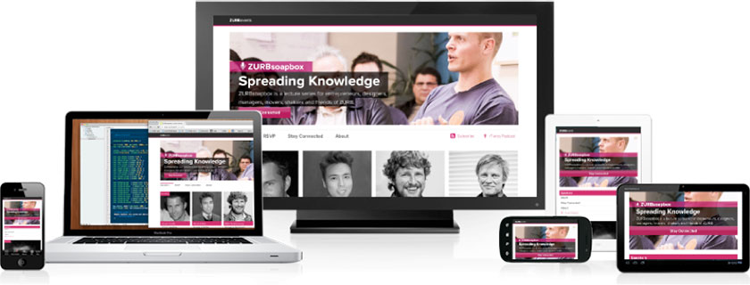
There are two options to choose from when it comes to creating a mobile-friendly site: a mobile website design or responsive website design. Where a responsive website design is more affordable and only requires one-time content uploads, a mobile website design may be the better option for businesses that want different features and plug-ins on their mobile vs. desktop site. The idea behind a responsive website design is that design and development should respond to the user’s behavior and environment based on screen size, platform and orientation.
Flexible Elements
Website that are not designed to be responsive are penalized by the search engines, dramatically lowering your SEO ranking. To ensure that your site avoids this penalty and users can easily navigate your site from any device, we implement several elements to increase site flexibility. These include: a flexible grid that adjusts according to screen size, images that will look good on multiple platforms, CSS media queries, and commands that show/hide content that might hinder or encourage conversions. Our custom web development services let you be in control of your site’s responsiveness. You can omit certain product details on your mobile site or choose how your menu bar shows up on iPads. We’ll work with you to find the solution that fits. more
Statistically Beneficial
If you’re still on the fence about responsive website design, consider that 60% of internet access is occurring on mobile devices. Plus, 40% of people will choose another result if the first one they land on isn’t mobile friendly. This means that no matter how hard you work on your SEO game, that first page ranking will mean nothing for conversions if the site isn’t mobile-friendly. In fact, with the mobile-friendly algorithm update that Google rolled out in 2016, you won’t be achieving that first page ranking in the first place. eCommerce sites are great candidates for responsive redesigns, since 4 in 5 smartphone users access retail content on their device monthly. In fact, 80% of shoppers use a mobile phone inside a physical store to look up product reviews, compare prices or search alternate store locations. With only 11.8% of websites utilizing responsive website design, you would have a huge leg up on your competitors. Plus, 62% of companies that designed their website for mobile platforms saw an increase in sales. That’s what a web development company can do for you.
Content that’s too long, slow load time, unattractive content and images that won’t load are the top four reasons for bouncing from mobile sites. You have .05 seconds after the page loads to convince your user that your site is worth investing in. As a web development agency, we know how to create a responsive website design that will strike immediate interest.
Investing in a responsive website design:
- Improves your search engine ranking
- Makes it easier for users to navigate your site from any device, leading to more conversions
- Gives you an advantage over your competitors