 What is a responsive website is a question we hear all the time. The words responsive website design were never stated until the last few years. The mobile phone has changed a lot as it relates to how companies present themselves from a digital marketing standpoint.
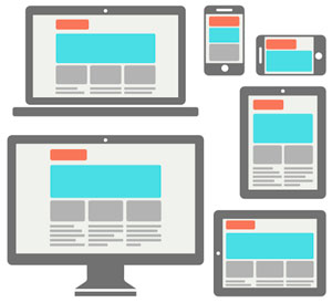
A responsive website is one that is created in such a way that when the viewers screen size changes the website design changes as well to accommodate the new screen size. The goal is to create an optimal viewing experience for the user no matter what device they are using to look at the site.
So now we know the answer to the question of what is a responsive website but what do we do with that information? One way to know whether your site is responsive or not is to look at it on your computer and adjust the width of your browser window. If your site’s images and copy move around and become a long easily readable screen your site is responsive. If it just cuts off the right side of your website it is not. Some sites may move content around but when viewed on a mobile phone it still doesn’t look good. This means someone built your website with a responsive theme but didn’t take the time to update the mobile view.
Building a responsive website is not as easy as building a website for the desktop only. Your responsive design company basically has to create different website designs (one for the desktop and one for the mobile phone). If that’s not enough, they have to ask themselves what mobile phone. Today, our mobile phones come in all sizes. The designer has to pick one screen width to optimize to.
What if you want your website to be responsive and look good for the mobile phone and also the tablet. This introduces another level of sophistication. Now the designer has to create three different designs and just like the various mobile screen sizes the designer has to deal with the various tablet sizes as well.
Why Should I Care About a Responsive Website?
There’s a couple of reasons you should care. More and more people are using their mobile phones to research companies and look at their websites. If you check your website statistics you’d probably see about 40-50% of the visitors are viewing your site from a mobile phone. Having your website optimized for the mobile phone (responsive design) allows the mobile user to easily look through your products and services. If they have to pinch and zoom to see aspects of your site, they’ll get tired and go to the next company.
Another big reason you want to make your website responsive has to do with SEO on mobile phones. Google has recently changed their mobile search engine to rank sites that are built for mobile phones (responsive) higher than those that are not responsive. This means if your competition has a responsive site, mobile users will see their listing in Google prior to yours. We all know how important Google and the other search engines are to sales today. It’s important that your website is properly optimized for the growing number of mobile visitors to maintain and/or increase your sales.