We’ve compiled a list of the best business websites in Johnson County. Then we outlined what aspects make their site a standout. As one of the most influential counties in Kansas, you better believe they have some amazing company sites representing. If you’re looking to create or edit your own business website, use these examples to inspire your layout and design (and take a look at our eCommerce website guide while you’re at it)!
Ferrellgas
This propane solution company boasts an easy-to-navigate site that fuels our click obsession and is optimized for conversions. They prove that just because your company isn’t sexy doesn’t mean your website can’t be.
Visual Appeal
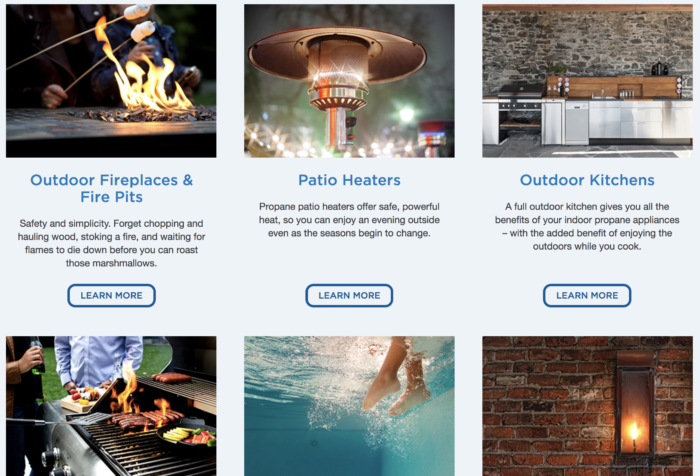
Aside from the general appeal of their typeface choice and color scheme. Their high-resolution photography is aesthetically pleasing. While also being relevant to their mission and lacking the stock photography phoniness. Including their brand logo in several of the site photographs and feature testimonials/stories. That show off the real human that’s being praised. Also incorporate icons, a great tactic to get the message across in a space that doesn’t warrant an entire photograph. They do a great job parceling up their pages to keep things interesting. Instead of several paragraphs of text, they break things up with category columns and accompanying pictures.
Conversion Optimized
If you look at their sub-pages, you’ll see that they include a ‘find a location’ bar and contact channel to the right of the page information. This shortens the conversion funnel and makes the page seem less bare. You have to strike a careful balance between a cluttered page and a page that will lose the interest of your visitors.
They also include a call-to-action button at the bottom of the page: ‘become a customer’. It’s a smart idea to include buttons rather than hyperlinking ‘contact us’ within your copy, since people enjoy clicking buttons and interacting with your site. They make conversions available on every page by including a phone number, ‘request a refill’, ‘contact us’, and ‘locations’ link on the header. Even if you’re not looking for propane delivery, take a gander at one of the best business websites in Johnson County for some inspiration on your own website design.
Key takeaway: Play into your visitors’ button obsession, show images of real people within your company and include a conversional channel on every page of your site.
Garmin
It makes sense that a large company like Garmin would have the resources to create a stellar website that perfectly showcases their products and embodies the lifestyle of their target consumer. They’ve branched out beyond their GPS roots to encompass an array of technology, and this expansion is reflected in their website.
Homepage
They do a great job utilizing video to keep their visitor interested, and their homepage introduces itself with a near full-page display banner. This banner shows off their latest products in a way that only images can. They also include a horizontal bar along the top of their display slider that advertises their current promotion. They include a header and search bar that makes it easy for visitors to find what they’re looking for.
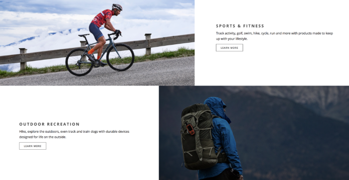
When you scroll down, you come across new arrivals and a stylish column design. They take time outlining their tech product categories (with the option to ‘learn more’). Their image choices reflect the action-packed, adventurous lifestyle that their brand stands for. They round the homepage out with another conversion point—the option to enter your email and receive the latest news. Their footer includes a sitemap and links to their social media accounts.
Product Pages and Navigation
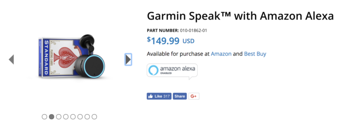
Navigation and product searching is made easy with their intuitive drop-down menu and filters which allow visitors to customize the parameters they’re wanting. Their product pages are thorough, giving visitors enough information to make a purchasing decision and giving search engines enough information to help with their organic rankings in Google. So they include multiple product images (some with other objects in the picture to scale). Sites that you can purchase the product from, a button to share the product on social media, a description of the product (sometimes with video), suggestions for products you might also like and compatible products. Their product pages even outline the specs, giving interested shoppers the exact display size and capabilities.
Key takeaway: For one of the best business websites, use images that will appeal to your target demographic, create thorough product pages and make your current promotions known on your homepage.
iModules
This technology company provides analytics services, design services, training services, etc. to the less tech-savvy population. These services are explained and sold on a platform that provides instantaneous help, detailed sub-pages and intriguing animations/illustrations.
Homepage
One of their standout smart moves is making their purpose known right from the get-go. Once you land on the home page, you’re greeted with a high-resolution photo with lowered opacity and the phrase “Helping educational institutions build and sustain lifelong relationships with their alumni and supporters” displayed across it. By immediately stating their purpose, they make things easier on the visitor. Beneath are two buttons—one to sign up for newsletters and another that’s an intro to iModules.
They use colorful, clickable icons to show what they do, and their site is full of unique illustrations. A bar along the middle of the homepage shows off the logos of their clientele, reassuring potential buyers that they’re in good company. They also showcase their proven results on the homepage, using stats to back up their claims of excellence. Along the bottom, you’ll find testimonials and a 5-field contact form. If visitors are hooked without needing to explore beyond the homepage. You know you have one of the best business websites if you can convert your visitor without them ever leaving the homepage.
Animation, Quick Help and Resources
They include social share buttons on their pages to expand their organic reach, and they have a ‘chat with sales’ button at the bottom of the page to ensure visitors receive immediate support. One of my favorite features about their site is the animation. Icons and text fade in as you scroll down the page, and images automatically switch out with their slideshow feature.
On top of a lively site, they also have an information-packed site. Their service pages offer the option to download a PDF or download the FAQ related to the topic, a great tactic for tracking conversions. Resource Library includes everything from case studies to webinars to articles, proving their expertise and reinforcing their capabilities. The thorough ‘articles’ section also helps out with their search engine rankings. To have one of the best business websites, you also need the SEO points to get your site found in search engines.
Key takeaway: Offer a chat option on your site. If your product/service might require immediate troubleshooting. Use animation to intrigue your audience and include a plethora of helpful content to boost your SEO. Then establish your position as an authority.
Fry Orthodontics
What this orthodontics office has going for it (aside from achieving stunning smiles). Is a site with content—and plenty of it. Between their thorough treatment option pages, dental health tips, blog, individual office location pages and new patient guides, you can rest assured that you’ll find everything you need to know on their website. They rank as one of the best business websites in Johnson County because of their authenticity and ease of use.
Interlinking, Info Pages and a Free Gift
Their site opens up with an image slider on their home page. That’s overflowing with quotes from satisfied patients. Plus a button to download their free e-book on braces and Invisalign. They hook their visitor with a free gift and give proof that they’re a reputable business. The site does a great job interlinking pages, including external links, and providing useful information. This can be used to aid their visitors and affirm their credibility.
These dental health pages give details on how to prevent bad breath, flossing, taking care of braces, etc. Better yet, each page comes with non-stock imagery that reflects the page topic. They use a larger text size to increase readability. In addition each of these pages includes a box directing them. To ‘get the healthy, beautiful smile they’ve always wanted’ by clicking the button below. This ensures that these pages are leading to conversions. Rather than a quick page bounce after the visitor has received the information they were seeking.
Blogs, Maps and Picture Proof
In addition to these static information pages is a blog that is updated monthly. These posts address common questions that a potential or current orthodontic patients might have. Then each post ends with an invitation to contact them. They also categorize their blog posts by topic and add tags to make searching easy.
Since they have so many locations around the area, they include a map on their contact us page that pinpoints each location for reference. This makes it easy for you to visualize their locations and see which office is closest to you. They made a smart move by including a before and after page that shows how they improved their patients’ teeth. It even brings up a testimony quote box when you click on the pictures. By providing picture proof of their accomplishments on their site, they boost their conversions. Bonus: aside from having one of the best business websites, they have an app available as well!
Key takeaway: Give your visitors as much relevant information as possible. Include a map if you have multiple locations and offer a free gift to hook your audience.
Contact Us
If you’d like to follow in the footsteps of these greats, contact us. We would love to help you get started on a website design that you can take pride in. Interested in stellar websites outside Johnson Country? Check out our blog post on the best website development in Kansas City. We can help your site rank as on the best business websites by combining the expertise of our SEO specialists, in-house designer and experienced developers.


