If you’re wondering how to make a website mobile friendly, start with speed. Page load time is instrumental. If your user can make and drink a cup of coffee before your contact form loads, you have a problem. The chief cause of this issue is images, which account for 68% of the total page weight. It’s key to remove images that aren’t doing anything for your brand (ie: stock images) and optimize the images that are necessary to your message. In this post, we’ll tell you how to avoid the lagging load times, different approaches to image loading, and how mobile responsiveness is imperative to your mobile marketing success.
Resizing Photos and Responsive Designs
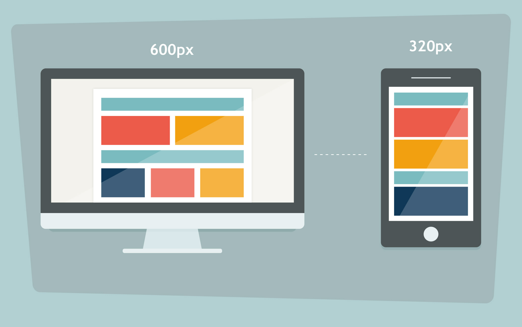
Tip number one: Avoid large images when possible, since their information density is typically low. It’s a pain for people to have to scroll down to get real information from your page. Responsive one-column designs create images that fill up the whole container width, resulting in full-page images. If you’re not sure exactly what size to make your images, a good benchmark is 29KB for JPG and 16KB for PNG. You can cut down on the weight of your image by saving it at the right size and resolution. Photoshop allows you to compress an image, and TinyPNG can reduce the weight by 79%. If you don’t size images for the largest possible device, those images are not going to look pretty on that desktop. Many choose to go with a responsive website design so they don’t have to worry about resizing all the images on their site. Responsive website designs serve the same website to different devices through CSS. The format of the site changes according to the device and screen size.
HTML Specifications
If the same images that appear on your desktop site appear on your mobile site, those who are trying to access your site on a lower spec phone in an area with poor connection are going to have problems. It takes much longer to deliver a larger image over the network, and a mobile device has to put in double time in order to decode and scale down the image. With HTML specifications though, developers can easily create alternate images for different device types by adjusting for the viewport, resolution and device capability. From there, the webpage HTML lets the browser know which image it needs to pull up and how much of the screen it should take up. Using the HTML <picture> element, you can reduce on the extra code used in JavaScript. By sending different images to each platform, you can allow for larger, higher resolution images on the desktop, speed up mobile load time with reduced picture size, and make a zoomed-in image on mobile accessible. In addition, retailers are able to display mobile-friendly hero images on mobile devices and traditional pack shots on desktops.
Types of Web Images
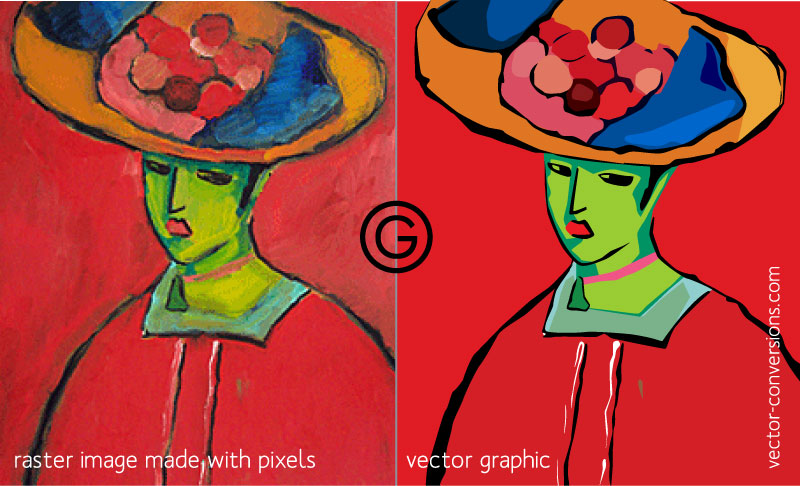
Before starting on image resizing though, you should have a general understanding of the different types of web images: raster and vector. Raster images are composed of dots, while vector images are made up of lines and shapes. Raster images would be JPEGs, PNGs and GIFs, and SVG (a new format that isn’t widely used) is a vector. PNGs are normally classified by higher quality graphs, logos, icons, illustrations, and photos with graphical effects. GIFs are normally animations, simple graphs, icons and logos. JPEGs work best for web photographs, and SVGs are common among graphs, logos and page headers. Each of your images (icons, buttons, photos, etc.) requires an individual browser request, slowing down your load time.
Creating Faster Load Times
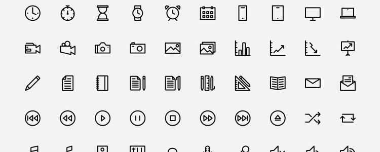
To combat slow load time, follow these simple steps. To lower image requests, you can combine a group of smaller graphics into a CSS file. You can also send a library of icons in a single file (Icon fonts pictured below) and utilize shapes built in CSS (including transitions). Another good rule to follow is to make sure that the text loads first. That way, users can browse your content and get to the gist of your site without having to wait for the images. Make sure content doesn’t shuffle around as images load though—that can cause users to click on the wrong link or lose their place in the text. This tactic is called deferred loading and can be done in JavaScript. Another option is lazy loading, which loads assets when they are needed. That way, content is loaded above the fold and then below the fold as the user goes down the page. For image galleries, you can have it set to where a thumbnail image loads and the larger image pops up when the thumbnail is clicked. Finally, progressive image loading loads low quality images while the webpage is being rendered. Once the page is all caught up with primary content, it replaces the low-quality images with a high-quality one. This type of loading doesn’t leave users waiting for secondary images to load, like deferred loading.
Placeholders for Images
According to Jose M. Perez’s article, Medium prevents reflows while the images are loaded by ensuring all components are rendered in their final position (intrinsic placeholders). To start off, a tiny version of the image is loaded (JPEG thumbnails with low quality). The small image markup is returned in HTML as <img>, so the browser starts fetching them immediately. Next, the image is drawn in a <canvas> and the data is passed through a custom blur function. The main image is requested at the same time, and, once loaded, is shown in place of the canvas. Google Search does something similar when used on a smartphone, except they show a solid color background in the place where an image would go. This allows the page to load faster. This is a key component of how to make a website mobile friendly through load time.
Site Audits
Since the average mobile webpage is 2.2MB, it’s imperative that you optimize your site for a speedy load time. This can be done by conducting a speed test on mobile devices to determine what’s slowing down the site. Then, ask yourself whether the image that’s slowing things down is worth the load time. Is it adding to your content? Is it providing unique information that a user couldn’t gather from the text? Go through and remove the images that aren’t adding value to your site. Slider images, for example, take up a lot of space on your site, and research has shown that they don’t contribute to conversions. With the images that you choose to keep, make sure that they all follow a consistent format and size.
Ecommerce Site Images
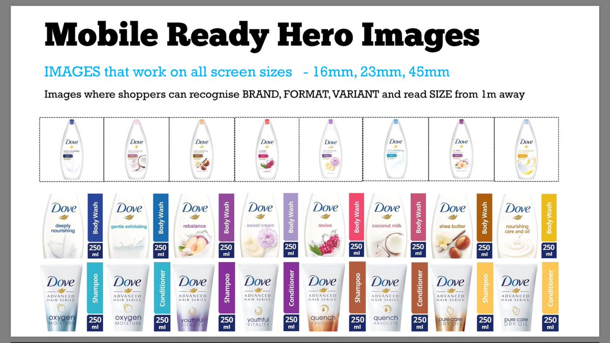
Ecommerce sites especially benefit from images. We’re a lot less willing to buy a product if we can’t see a picture of it, plus images make it easier to find what you’re looking for in your quick, vertical scroll of the search results. Ecommerce sites thrive on hero images, since they provide a clickable banner at the top of a homepage that features a new product, promotion, etc. and a call to action. The mobile-ready hero images are “the smaller thumbnail images found on a page of product listings either in a category or following a search”(Search Engine Watch). These images act as the primary images in search thumbnail results and are designed to work well on all screen sizes (mobile, tablet and desktop). They make it easy for shoppers to identify the brand, format, variant and size while they are searching. Eye tracking research has shown that 90% of the ecommerce page ends up ignored, and most shoppers don’t even notice the product name, size or format. We’re visual creatures, and we often make our buying decisions off sight alone. Since online shopping is all about convenience, people want to be able to add items to their cart as quickly as possible. Hero images are an instrumental part of how to make a website mobile friendly.
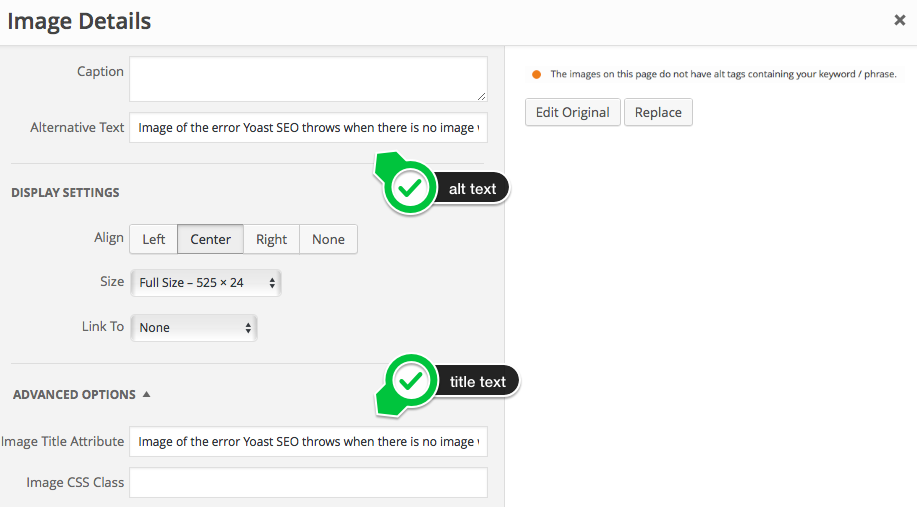
Site Accessibility
On top of speeding up load time, you should audit your site’s images for ADA compliance. This means adding alt text to your responsive images. You should also make it easy for those who have bad vision to enlarge your image with their zoom feature. Since screen readers don’t yet have image recognition on the web, they won’t be able to pick up on an image If it has text overlaid.
Contact Us
Still wondering how to make a website mobile friendly? Check out our blog post on resizing photos and website building software to see whether this is something you want to tackle on your own. If your site’s mobile load time isn’t up to par with your desktop version, contact us so we can figure out the root of your problem. Our mobile development services include a mobile website design, mobile landing page, and responsive website design. In some cases, it might make more sense for you to develop an app for your service rather than create a mobile version of your site. If so, take a look at our iPhone developer, Android developer, iPad developer and Android tablet development services. With Google’s new mobile-first index, you want to be sure that your search engine ranking isn’t being negatively affected by a slow load time. If your site’s slow load time creates a high bounce rate, Google will take notice and lower your ranking. Our job is to ensure your site gets the traffic it deserves.