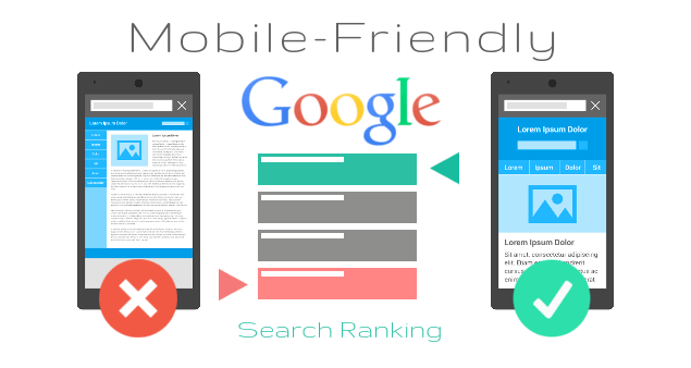
Google’s New Mobile-First Index
When you’re sitting in your room contemplating a new restaurant to visit for lunch, how do you normally check out the options? Is it more convenient for you to Google them on your phone, or fire up your laptop and browse on your desktop? Recent studies have found that internet browsing takes place more often on mobile devices than on desktops. Because of this, Google will be transitioning into a mobile-first index to index their content. Rather than taking site appearance and usability from a desktop version, they’ll look at how your mobile site performs. They’ll begin ranking your desktop site based on the performance of your mobile site starting in the second half of 2017, meaning you only have a few months to start the mobile development process if you haven’t already. While it may be easier for some to contact a digital marketing agency, this guide gives a breakdown of the different types of mobile sites you can have, the features needed in a mobile site, and the extensions you can use in CMS platforms to get the job done with one click.
Within just the past four years, mobile use has grown nearly 400%, and nearly 20% of users between the ages of 18 and 34 spend all of their online time on a mobile device. Not only that, but 61% of people said that they would bounce right off a site if the mobile experience was negative in 2012. Five years later, the expectation is that all mobile sites work just as well as the desktop counterpart. That’s where mobile development comes in.
Positive User Experience
Before this change takes place, you can update your mobile site to ensure your rankings don’t crash. You may not realize it, but your mobile site might actually be a more watered-down version of your desktop site. This is more common of an occurrence with mobile sites that have separate URLs or when dynamic serving is being used. On a mobile version, some videos may not appear in order to increase the load time of your website. Typefaces may be too large for a mobile screen, and users may have to scroll for several seconds to access the information they really need. In a world where the human attention span is shorter than that of a goldfish, that spells trouble for your business. If there’s important content that needs to be displayed, consider shortening it or adding it to another page. A simple ‘read more’ button creates a clear interface while still giving you those stellar SEO rankings. Plus, it allows users to view products on an ecommerce site rather than reading through a bunch of information that they don’t really need. You might even consider moving the written content to the bottom of the page. Make sure that your headings (H1s) and titles are not missing from your mobile site pages, as this can affect your ranking negatively.

Load Time
One factor that plays into your mobile ranking is page speed, since it boosts your usability. The same goes for your current desktop site ranking, but site load time can be even more intricate on a mobile device. Accessing your site might be more difficult from a mobile device that isn’t connected to Wi-Fi, for example. You can monitor the speed of your site through Google’s PageSpeed Insight Tool. If it’s taking longer than three seconds for your site to load, consider utilizing GTmetrix’s Waterfall feature to see what requests are slowing your site down. You can also check out their tips to speed up your WordPress site to increase organic traffic!
Internal Linking and Site Structure
Other issues that might arise during the mobile development process is internal linking and site structure glitches. If you use dynamic serving or separate URLs for your mobile site, you’re going to see some differences with the internal linking compared to the desktop version of your site. This messes up your user experience and plummets your ranking when Google crawls it. Another thing you’ll need to do is transfer structured data over to your mobile site. If you’re not sure whether your mobile site already has the same structured data as your desktop site, you can run it through Google’s structured data testing tool.
Remove Full-Screen Ads
If you have an ad-heavy site with low-quality content and poor usability, you need a makeover. Full page banners are now a no-no in the Google world, since intrusive interstitials are more likely to drive away users than result in conversions. The key to mobile development is user experience, so make sure you aren’t shoving too many ads in their face!
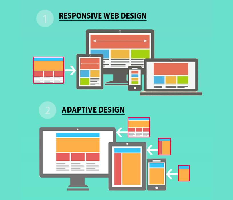
Responsive Web Design
If you have no experience with mobile development, you’ve come to the right place. There are a couple different options that you can go with when it comes to developing a mobile website. The first route you can take is a creating a responsive web design. This design responds to the device and the size of the screen that it’s being viewed on. This allows you to take the corner of your internet browser and drag it in to make it smaller while still maintaining the integrity of whatever website you’re viewing. Responsive designs are the most common since they require less work. Check out these WordPress Plugins that make your site mobile responsive!
Adaptive Web Design
Adaptive web designs are a time commitment, but they give you the ability to create a custom site for different devices. Adaptive websites (aka mobile optimized sites) identify the device and adapt the website to provide the best experience for users. Since they’re more complex, they oftentimes cost more money than the responsive designs. Several companies have found an increased conversion rate when they build adaptive websites. Essentially, the site will reformat content, enlarge navigation buttons, and optimize images differently depending on the device being used. The issue that comes with creating a separate website for mobile is that Google might penalize you for duplicate content, so keep that in mind before you begin the process. Most mobile development agencies know how to bypass this problem.
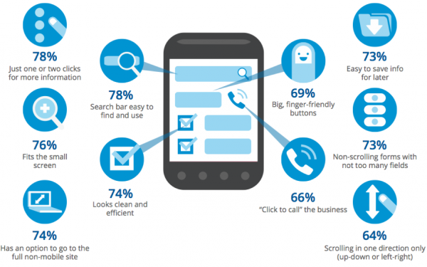
Features of a Mobile Site
According to Hootsuite’s Tips to Creating a Mobile Friendly Website, some of the key features that you’ll notice in a mobile site are:
- Simplified navigation that is “thumb” friendly with large touchpoints, especially for critical contact information
- Reduced graphics that don’t interrupt the quest for critical information such as product listings or commoditized content
- Avoid making users type unless absolutely necessary
- Give users the option to view the desktop version of your site
Font sizes should be 14px, so users don’t have to zoom in to read your content. Anything smaller than 12px font should be used only for labels or forms. It’s good to include larger buttons since users get frustrated when they can’t click a button or end up clicking the wrong one on accident. Apple’s design guidelines suggest button sizes be at least 44px by 44px, and iOS devices now have HD screens that require an image double the resolution of the desktop. This high resolution prevents images from becoming pixelated or blurry on your retina-quality screen. For sites that use a lot of video, YouTube videos are a great solution to ensure they look clean on any device. Since the embedded code on YouTube is already responsive, all you have to do is copy and paste! Also, make sure to include a ‘go to full website’ or ‘view desktop version’ functionality on your mobile site. That way, people can view the full version of your site if there’s a specific thing they’re looking for.
Menus
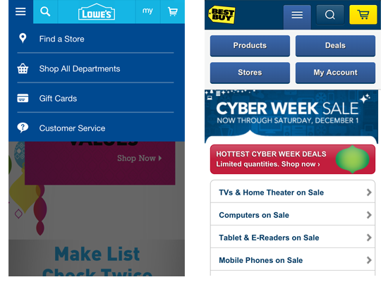
Menus can be a hassle when you’re dealing with a site that has several navigational items. With simpler designs, you can place them on one line. Sub-menus are a whole other story though. You can choose to either hide the menu altogether with javascript and then allow it to appear on press, or you can move it to the bottom of the content and have an anchor attached to it at the top. The first option is better, since some users might be confused when they’re transferred to the bottom of the page. Plus, they have to swipe back up to the top of the page afterward to access your content. A great solution for mobile menus is to have a single button next to the logo that expands on touch and mimics a native app. With this setup, you’re taken directly to the sub-menu with a back button when you select a top-level menu item. The advantages to this setup are that the content behind the menu remains even if the reader abandons the menu, the user doesn’t have to swipe to see all the menu items, and the interaction process is similar to that of a native app. Menus will be the most tricky part to design during the mobile development process.
Contact Us
Check to see whether the website building software that you use already has an extension that can make your site responsive. The Responsivizer for Joomla! includes multilevel mobile menus, adaptive image resizing and optimization, responsive video readiness, and a custom mobile home page. You may even want to go with a mobile application if your users spend more time on the mobile version of your site than the desktop version. If you’d like to get started on your own responsive website design or learn more about mobile development, contact us for more information on how we can help you achieve your goals.