Companies talk about themselves all the time, but why not brag on some of our local KC talent? Website development in Kansas City is booming, so we thought we’d showcase some of our favorite websites from local businesses. These businesses have mastered the user experience and aesthetics of web design, expertly integrating their own brand into either a template or customized interface. If you’re looking to replicate their success, check out our eCommerce development guide.
1. Hand and Land
Pop-Up Conversion Funnel
From a marketing standpoint, they’ve taken a bit of a risk with their site. An automatic pop-up asking whether you’d like to ‘sign up for the latest toxic free finds’ could either generate a ton of emails for their database (leading to conversions) or scare people away. Since it’s easy to close and the pop-up doesn’t take up the entire screen, we’re going to call it a smart move on their part.
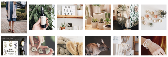
Beautiful Photography
Visually, the site incorporates a beautiful album of high-resolution photos into each page of their website. Their photos showcase their products—no use wasting valuable space on images that aren’t going to inspire customers to make a purchase.
Product Listings that Get to the Point
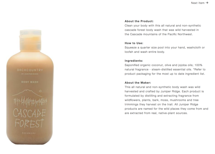
As far as ecommerce goes, their product listings give you the most important information without cluttering the page—a picture of the product and price show up automatically, and you can visit the product page itself for more information. They go into details about the size, how to use the product, what the product does, the ingredients, and a quick paragraph about the maker.
Not only is this beneficial for the customer, but it’s also a smart move on Hand and Land’s part. They have automatic SEO points! Many businesses suffer in the search engines because their product pages aren’t descriptive enough. If you don’t have enough text (around 300 words), Google will penalize you. By including these details on a separate page, they ensure that users aren’t overwhelmed while searching but can still access the information they need to make an informed buying decision.
Industry-Specific Blogging
Hand and Land also has a blog on their site, which gives them fodder for their content marketing and social media marketing. Plus, even more points for SEO! While their blog still seems to be in the infant stages, we’re excited to see how the company establishes itself as an influence in the toxin-free market through informative post updates.
Hand and Land earns point for….
- Stunning photography that showcases their products
- Detailed product pages
- An informative blog
Side note—their website is powered by Shopify, an easy-to-use CMS that’s extremely popular among ecommerce sites and great for website development in Kansas City.
2. Midland Radio
Dynamic Features
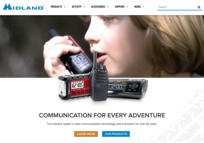
Talk about dynamic. This site seamlessly integrates text, photography and video, even incorporating overlap between some of their media elements to add dimension. As soon as you enter their site, you’re greeted with a video that cuts out the infomercial and focuses on the experience of using their products. It taps into the lifestyle of their target audience and the many ways their product can be used. You’re hooked even before reading a thing about their product.
Intuitive Menus and Search
Once you start scrolling, you’ll come across an easy-to-navigate menu that switches from a zoomed-out image of someone using the product to an image of the product itself as you hover over the box. The site even allows you to browse products by interest—you can choose from hunting, camping, off-road etc. This is a great feature for users that know the activity they’re interested in but don’t necessarily know what equipment they’ll need for it.
Product Reviews that Convert
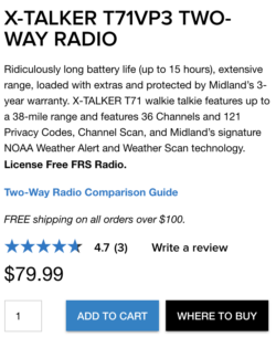
What sets their product pages apart is that they show product reviews and recommended products. They even include warranty information and frequently asked questions. By being so up-front about the products they’re selling, they give that added trust factor. Reviews can be tricky—if you decide to include a reviews plug-in, you run the risk of one bad apple scaring away dozens of potential sales. You can encourage satisfied customers to leave reviews on your site to help prevent this though.
Midland Radio earns points for….
- Utilizing video on their site to immediately capture the attention of their visitor
- Allowing users to search products by interest
- Providing plenty of information about their products
Side note—not to brag or anything, but we made their site! If you like the layout, you should contact us to learn more about our web development services.
3. Artego Pizza
Pop-Up Conversion Funnel
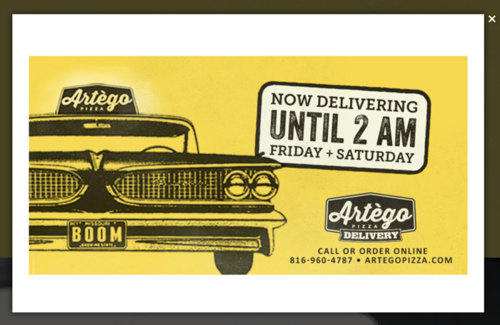
We’ve got another pop-up here, but we forgive them because the promotion is just so stinkin’ good. FREE DELIVERY! That’s a tough one to pass up in a day and age when added fees and hidden taxes ruin our shopping experiences on a daily basis.
Single-Page Simplicity and Beautiful Design
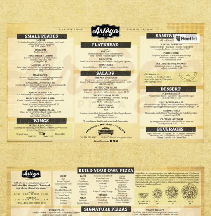
Once you look beyond the pop-up, you’ll see a colorful website that overlaps text and images to make the scrolling experience just as fun as eating the pizza. Their stylized typography, consistent color scheme and single-page access to any information you could need lands them a spot among our favorite Kansas City websites. By including their full menu, about us paragraph, photo gallery and map on a single page, they can simply scroll you down to the section you’re interested once you click a topic on their menu header.
Dynamic Banner
To compensate for their lack of pages, they have a media box at the top of the site that rotates through promotions, online review shout-outs, food images and banners sharing their social media accounts. What makes these banners dynamic though is that they incorporate movement, slowly zooming in on photographs of their food and letting their text drop and slide onto the screen.
Artego Pizza earns points for….
- Incorporating movement and overlap into their content
- Utilizing a simple, one-page design that makes navigation easy
- Effectively advertising what sets them apart: free delivery
Side note—you can order ANY large pizza on Mondays for $10. Speaking from experience, their pizzas are delicious.
4. Doughnut Lounge
Quirky Design
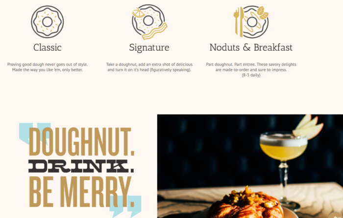
Speaking of delicious, our next website comes from a business that brings together two of our favorite things—donuts and alcohol! Their site merges some other great elements as well, namely killer typography, unique illustrations and some fun scroll features. They know they have an awesome logo, and they feature it prominently on their homepage. Instead of keeping the same, boring typeface throughout, they mix it up to reflect the quirkiness of their brand. Illustrations are simple and keep the same tone as their site—they even made little doughnut social media icons! Details like this tell users that this brand is dedicated to their identity. Their menu boasts the same creativity, using a media collage as the backdrop for their delicious offerings.
Featuring Real Employees
What really boosts the trust factor for this business is the ‘faces of doughnut lounge’ page. Here, we get to meet the people who made the Doughnut Lounge happen. The page even gives us some details about their cuisine background. It would be really cool to see this expand to include some of their servers and bartenders. It’s always an honor to be showcased on a website, and customers enjoy putting names to faces!
Doughnut Lounge earns points for….
- Illustrations and typography that would make any designer swoon
- A staff page that humanizes the brand and increases the trust factor
- An online menu that acts as an extension of their site, combining illustrations, photographs and text
Side note—their website is powered by Rocket Cloud. This company isn’t necessarily website development in Kansas City, but it was made for a Kansas City business.
5. Boulevard
Engaging Users
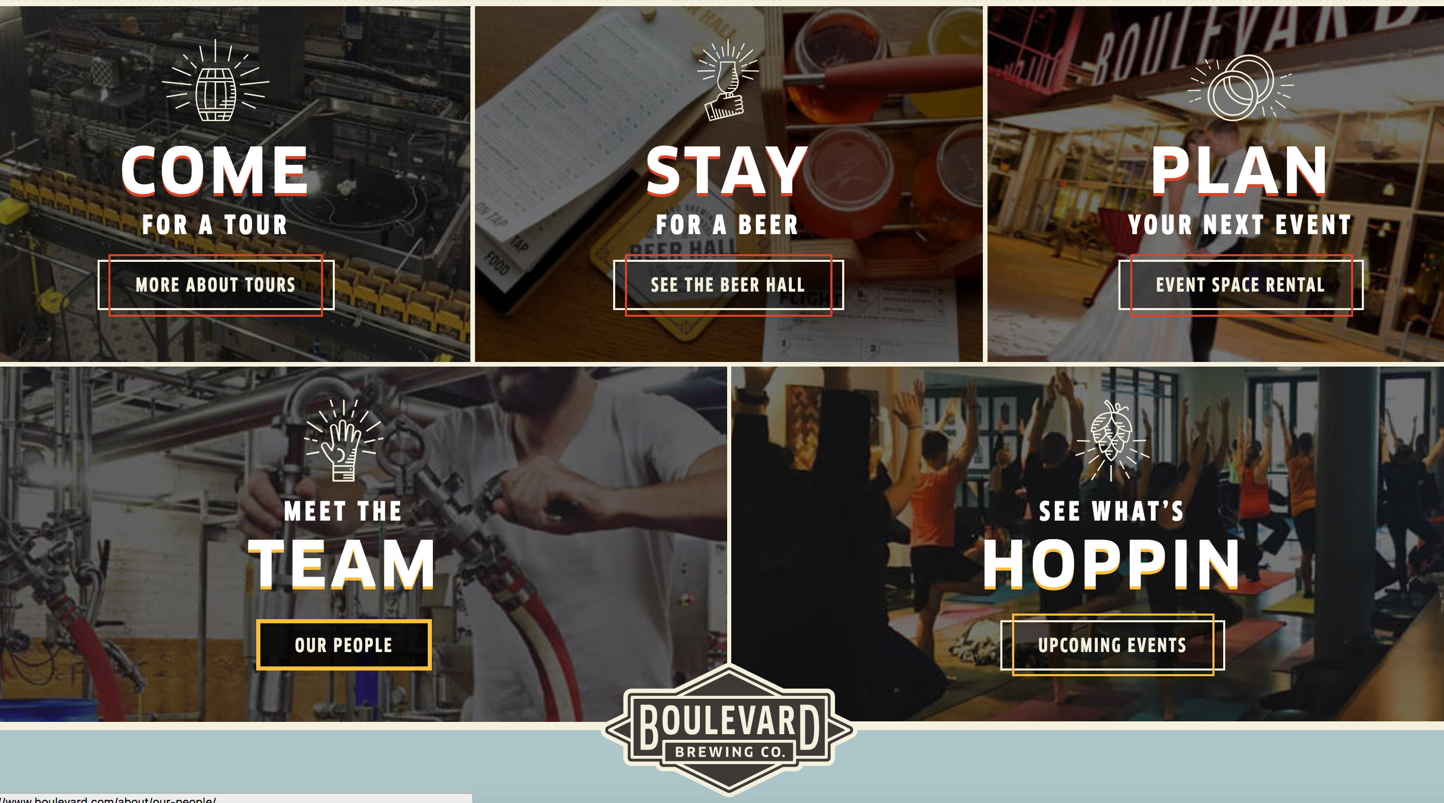
As if their cool new building and free tours wasn’t enough, Boulevard brings the heat with a site that makes the most of all available space and has enough content to keep you occupied for hours. Their typography is on point, their illustrations enhance the user experience and their repeated use of the logo shape throughout the site shows branding at its finest. Plus, they have a feature that allows you to find your perfect match beer based on your preferred hop, malt, fruit, and tart level. They go beyond informing you about their products—they engage you in ways that most sites couldn’t fathom.
Community Involvement
Boulevard keeps up with a community blog that covers expansions, releases, and event details. Boulevard is so well-known that they don’t have to worry too much about the SEO aspect—their content is purely informative.
This blog is a sub-page under their community tab which, upon further browsing, I found to be a great resource for Kansas City natives and tourists alike. Their ‘music’ section features individual pages about Starlight, Providence Medical Center Amphitheater, the Midland, Crossroads’ Grinders, Boulevardia and the Sprint Center. Basically, they consolidated what makes Kansas City great. I’m assuming another motivating factor for this page might be that these venues serve their beer, but I’m not complaining.
Their local flavor page and upcoming events page serve as a testament to their native pride. These guys know that their customers love Kansas City, and they use their site as a platform to show that this love is shared.
Boulevard Brewing Co earns points for….
- Their Community pages which provide a great guide to Kansas City
- Their feature that ‘taps’ into our self-obsession (perfect match beer page)
- Typography and design that make you eagerly ‘hop’ from page to page
Side Note—When they ask for a volunteer at the beginning of your tour, RAISE YOUR HAND. You’ll get some free beer out of it and all you have to do is bring up the rear during the tour.

